
It has been a while, the end fo the year was certainly fast paced (heart reference)!
And that gave me another dose of what I wanted to shift my passion for technology wise.
So, that brings me to the next adventure that I am passionate about exploring.
STOP! No, don’t worry, I am not leaving the Oracle technology space 🙂
But in fact, I want to look into the Data Visualization aspect of Oracle tech, and specifically, the product Oracle Data Visualization (DV) {cloud} or Desktop (DVD) {not-cloud} download DVD here.
It was only as recently as this past spring when I knew something wasn’t right (or left, that is an eye joke) with my left eye. And for me, the topic area of Visualization has become deeply passionate for me.
And so that led me to start reading books, researching online, listening to podcasts, and just plain talking to people.
One of the books that I read recently was a book called #Makeover Monday by the authors Andy Kriebel (vizwiz.com, Data School, Makeover Monday, Tableau Tip Tuesday and Workout Wednesday. He also writes at datavizdoneright.com) and Eva Murray (blog: www.trimydata.com).
Here is “The Book” -> #Makeover Monday http://www.makeovermonday.co.uk/book/
And that brings me to the topic of what I can see as the future of many blog posts to come. Each week as the new data for the week gets published I will participate in #Makeovermonday as it will give me a chance to explore new data, get feedback about the visualizations that I create and work on being able to tell good stories about the data. Lastly, I will focus on using Oracle DV(D) as my primary tool of choice although the #MM community prefers to use Tableau but they do not make that a requirement. You could create your canvas on a napkin, literally and totally your choice.
So, let’s get started on the first #Makeovermonday that I am participating.
Here is ..
The Data: http://www.makeovermonday.co.uk/data/
Week: Week 51
Date: Dec 17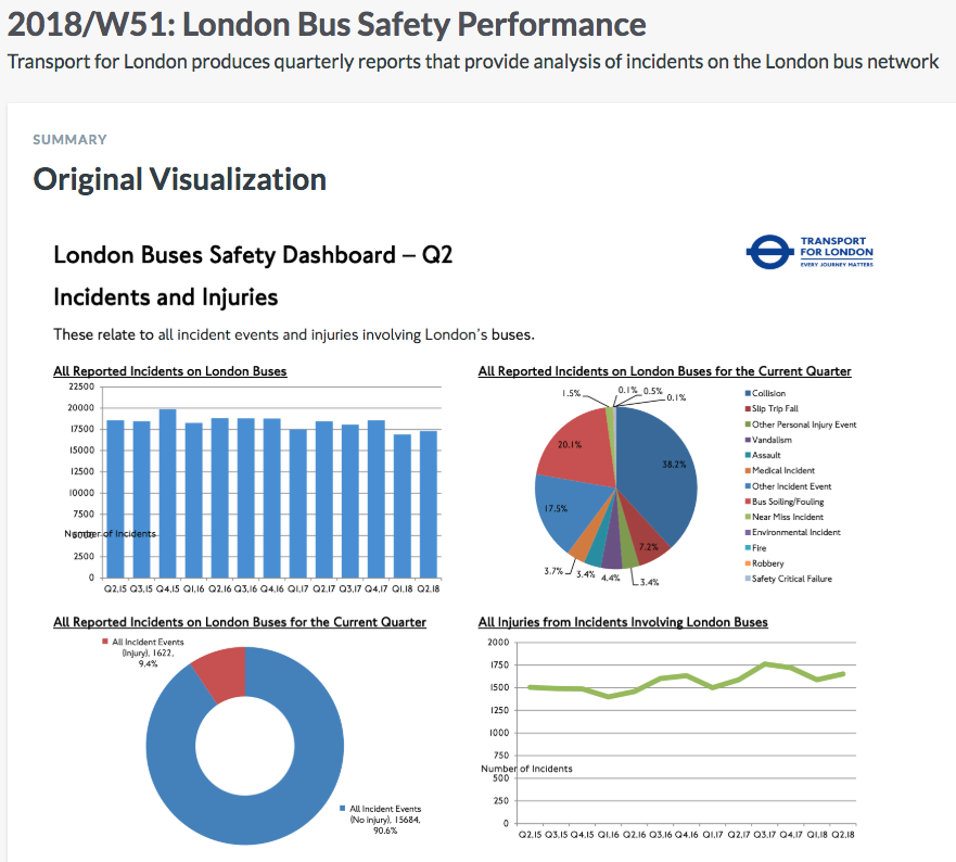 Data: data.world
Source Article Visualization:
London Bus Safety Performance (page 3)
Data Source: TFL (January 2015 – June 2018)
About this Dataset
DATA SOURCE: Transport for London
DASHBOARD: London Buses Safety Dashboard – Q2
Objectives
What works and what doesn’t work with this chart?
How can you make it better?
Post your alternative on the discussions page.
DATA DICTIONARY
View — No definitions added for the 1 file and the 11 columns in this dataset.
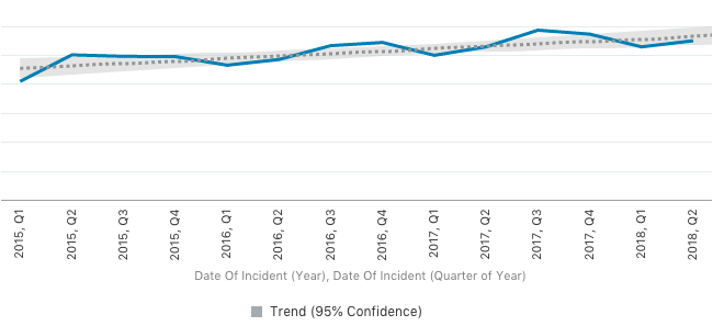
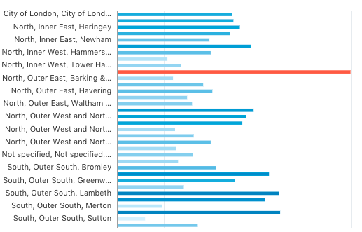
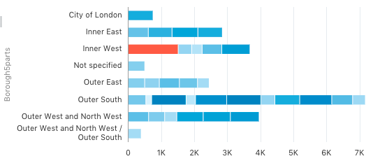
Now let’s get into the data and see if there is a story to tell.
This is the Data Visualization as a sum of the parts and the story that I was able to tell. Enjoy!
— — — — — — — — — — — — — — — — — — — — — — — — — — — — — —
~ letter ~


Dear Abby,
I am writing this letter to inform you about the bus safety,
or lack thereof when riding the London Bus.
This letter is to warn you about the HIGH amount of Bus accidents in London’s
Westminster borough!
You are at a higher chance of being involved in an accident since you are an
Adult Female Passenger. And therefor I believe that it is in your best interest
to select a different mode of transit.
And please, whatever you do, DO NOT RIDE a bus Operated by Metroline!
Sincerely,
A Concerned Data Visualization with a Birds Eye View


This was my first week joining the #MakeoverMonday and look forward to next week as well as 2019!
